Centering with CSS and Scroll When Content Overflows
This is a problem that I faced in my previous job. I am writing to record it for the sake of future needs.
✅ Desired Behavior
The child element should:
- Be centered within the parent element when smaller than the parent.
- Allow the parent element to scroll when the child is larger than the parent.
🧱 Base HTML and CSS
<div className="parent">
  <div className="child">
    <div className="grandChild">I'm a coconut</div>
  </div>
</div>

<style>
  .parent {
    width: 500px;
    height: 500px;
    background-color: #ebc1a8;
    overflow: auto;
  }

  .child {
    width: 600px;
    height: 600px;
    background-color: #009ace;
    border: 3px solid #ff3eb5;
  }
</style>
❌ Centering Methods with Issues
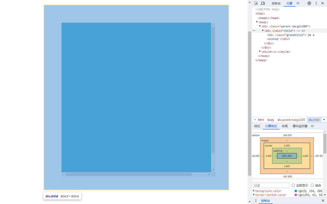
1. Absolute Positioning + margin: auto
✅ Horizontal centering works.
❌ Vertical centering fails when the child overflows — the top is clipped.
.parent1 {
  position: relative;
}

.child1 {
  position: absolute;
  top: 0;
  bottom: 0;
  left: 0;
  right: 0;
  margin: auto;
}
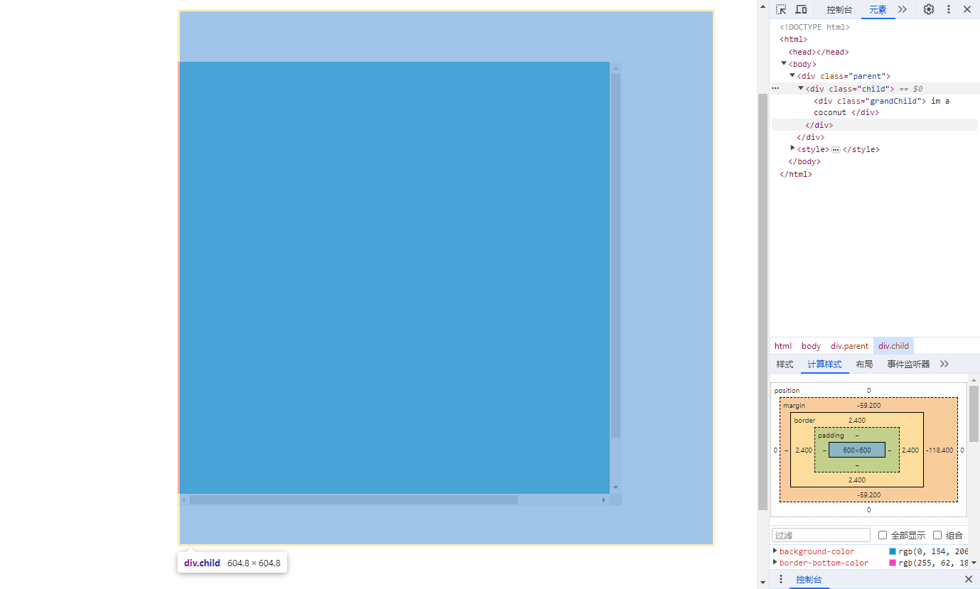
When you scroll to the top, you can see that the child element moves up with margin-top: -59.2px.
The vertical margin is not handled in the same way as the horizontal margin, leading to the top part of the content being covered.
Vertical margin split the margin evenly on both sides, while the horizontal margin only adjust margin-left to handle this situation.
2. Absolute + transform: translate(-50%, -50%)
✅ Centers both horizontally and vertically visually.
❌ Left and top parts are clipped.
.parent2 {
  position: relative;
}

.child2 {
  position: absolute;
  top: 50%;
  left: 50%;
  transform: translate(-50%, -50%);
}
3. Flexbox Centering
✅ Visually centers the child.
❌ Overflowing parts are clipped and not scrollable.
.parent3 {
  display: flex;
  justify-content: center;
  align-items: center;
}
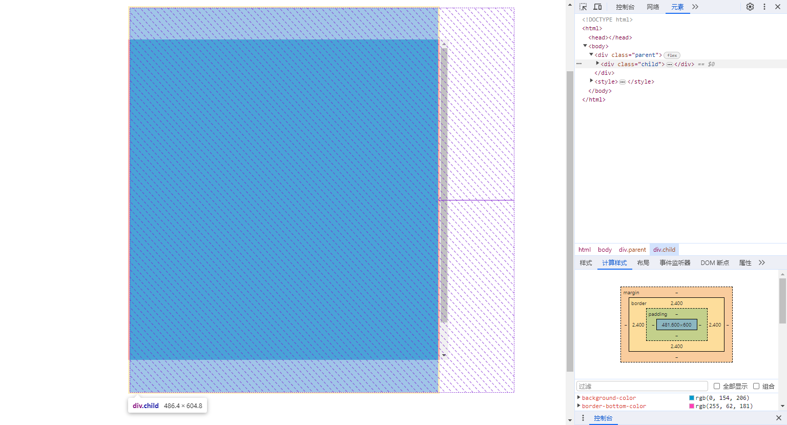
The flex layout forces the with of the child element to be its own width, as can be confirmed by the computed styles.
The height is set to its own specified height.
However, the top part of the child element is clipped because of the vertical centering with align-items
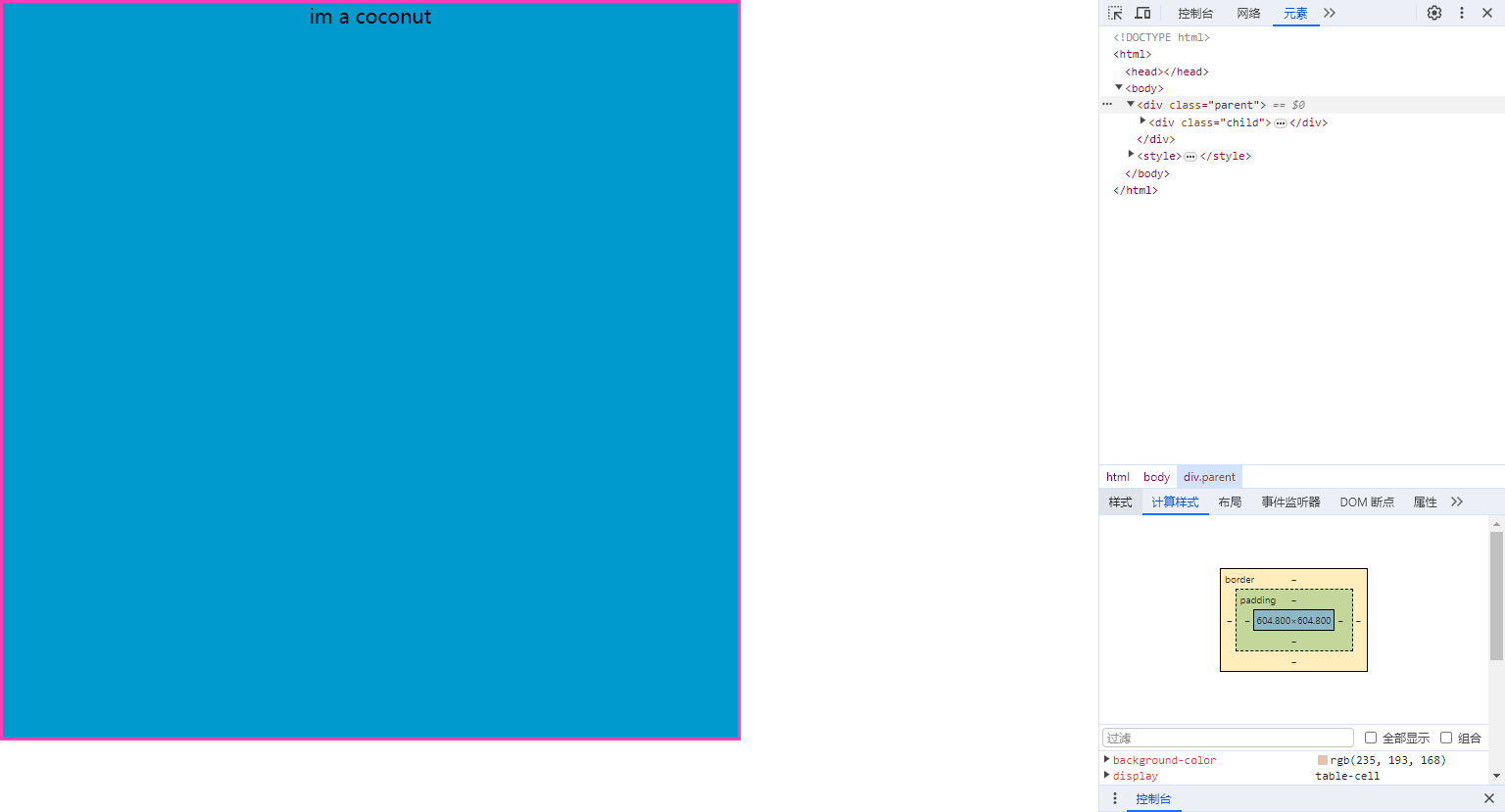
4. display: table-cell
✅ Centers well for small content.
❌ Child expands the size of the parent when it's larger.
.parent4 {
  display: table-cell;
  vertical-align: middle;
  text-align: center;
}
.child4 {
  display: inline-block;
}
✅ Best Solution: CSS Grid
✅ Perfect centering with scroll when overflowing.
✅ No content clipping.
.parent5 {
  display: grid;
  place-items: center;
}